

中英文对照解读,教你设计中如何应用好渐变色
渐变色是一种让设计师既爱又佷的颜色,这在于它本身的特性,渐变色被用于大胆的表现和引导用户情感,帮助用户联想到产品或某个想法,如果把握不好渐变色,那就容易丢掉设计。2018年的渐变色回归到设计主流趋势,越来越多色设计师把渐变色应用到设计当中,以下是一篇来自外国大神的文章,关于渐变色应用的解读,为了便于大家理解和学习,中英文对照带给大家,教你设计中如何应用好渐变色。

当你在用户体验设计公司工作时,你开始注意到行业趋势的周期性。就像时尚或艺术一样,过时的东西几年后必然会重新出现,然后被主流所接受,然后再一次被淘汰。
When you work for a user experience design company , you start to notice the cyclical nature of industry trends. Just like fashion or art, what goes out of style inevitably resurfaces a few years down the road, only to become adopted by the mainstream, and fade into obsoletion once again.
Back To The Future是最近重新流行的一种设计潮流的一个恰当例子,或许最引人注目的是2016年Instagram重新设计logo,以及Spotify的双色播放列表图标。渐变在用户界面设计领域越来越流行,因为,它们为界面注入了深度和纹理。它们扮演着独特的、甚至是相互冲突的角色:渐变实际上模仿了我们周围看到的颜色(在现实世界中我们很少遇到单色调),但它们也可以用来创建我们以前从未见过的颜色模式。
‘Back To The Future’ is a fitting example for a design trend that has just recently resurfaced today, perhaps most notably in Instagram’s logo redesign in 2016 and Spotify’s dual tone playlist icon. Gradients have become increasingly popular in the user interface design world, and for good reason—they inject depth and texture to the interface. They serve unique, even conflicting roles: gradients realistically mimic the colors we see around us(rarely do we encounter single tones in the real world), but they can also be used to create color patterns we’ve never seen before.
渐变是一种强大的设计技术,而伴随着这强大的力量带来的是一种巨大的责任。如果使用不当,渐变会造成设计灾难。它们可以打乱布局,分散用户的注意力,破坏整个界面的美感。在这篇文章中,我们揭示了制作渐变的秘密,它将会让你设计的界面提升到新的层次。
The gradient is a powerful design technique, and with great power comes great responsibility. When used improperly, gradients spell out a design disaster. They can muddle a layout, distract the user, and ruin an interface’s entire aesthetic. In this article, we reveal the secret to crafting a gradient that elevates your interface to the next echelon.
(一)要从一个坚实的基础开始(Start With a Strong Foundation)
关于如何选择色彩,你无须担心,其实你不需要成为色彩理论的专家,依然可以对渐变进行谨慎的选择。一般的经验法则是选择彼此接近的颜色,这样可以让它们更自然地混合。UX Planet 包括一个伟大的图表-看如何无缝的过渡从黄色到橙色是与绿紫色比较。
Don’t worry, you don’t need to be an expert on color theory to make prudent selections for your gradient. The general rule of thumb is to choose colors that are close to each other, thus allowing them to blend more naturally. UX Planet includes a great diagram—look how seamless the transition from yellow to orange is compared to the green-purple.

为什么轮子附近的颜色在视觉上如此吸引人?也许是因为这些渐变是自然发生的。这给UI设计师带来了一个极好的商业秘密:将自然作为灵感的来源。
Why are colors in proximity on the wheel so visually appealing? Perhaps it’s because those are the gradients that naturally occur so often. Which brings us to an excellent trade secret for UI designers: turning to nature as a source for inspiration.
(二)自然界中的渐变色(Gradients In Nature)
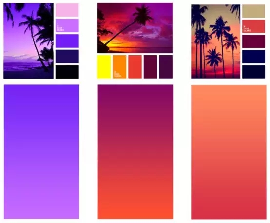
在我们的日常生活中会不断地遇到各种各样的渐变:天空、日落、水体。无论我们在世界的哪个角落,天空都是极好的来源。让我们来看看令人惊叹的自然画面设计师安娜·格伦(Anna Grenn)为我们展示的场景,以及它们的配套色彩。
We constantly encounter gradients in our day-to-day lives: the sky, sunsets, bodies of water. No matter where we are in the world, the sky especially serves as excellent source material. Just take a look at the breathtaking natural tableaus designer Anna Grenn showcases, complete with their accompanying color makeups.

虽然天空可能是最常见的渐变色来源,但其实这种案例还有很多。你每天其实都被这自然界中的渐变所包围着。现实生活的色彩都是混合在一起。
And while the sky may be the most common source material, there’s no end to examples. There’s probably a natural gradient around you right now. The color of the real life does not neatly fill inside the lines, but rather blends.
(三)升级提升到下一境界(Taking it to the Next Level)
如果你现有品牌的颜色不适合渐变。不用担心:在渐变中注入额外的色调是增强视觉效果的好方法,并能更好地区别你的UI。
So let’s say your existing brand’s colors aren’t exactly conducive to gradients. Never fear: injecting additional hues to the gradient is a great way to enhance its visual interest and distinguish your UI even more.
正如你所想的,当附加的颜色落在色轮的开始和结束之间时,它们会流动得最好。重温来自 UX Planet的相同图表:
As you’d imagine, additional colors are going to flow best when they fall in between the start and end color on the color wheel. Revisiting the same diagram from UX Planet:

只是要注意的是:你添加的颜色越多,你渐变色的复杂度就越高,设计的平衡性就越困难。你可以把目标定得高些,然后争取完成像Instagram的标志这样的多层渐变,但凡事都有度,如果你做得太过了,你最终会得到一个更接近这个故意设计得难看的MTV网站的东西。
Just be warned: the more colors you add, the more complex your gradient, and the more difficult a design balancing-act you’ll have to perform. You could aim high and shoot for a multi-layered gradient like Instagram’s logo, but go overboard and you could end up with something closer to this deliberately ugly MTV web design.


(四)光源和形状(Light Source & Shape)
即使确定了完美的颜色组合之后,要在设计中实现它仍然存在很多问题。首先,一些基本要素:
渐变应该与整体风格相融合,与整体布局保持一致,并指向用户该看的地方。对于x面多边形(正方形、三角形、矩形、五角形等),一般是线性渐变;而圆形区域需要径向。
Even after nailing down the perfect color combination, there’s still the matter of actually implementing it into the design. First, some of the basics:
Gradients should align with their containers, contouring to the layout and directing where the user’s eyeballs should be pointed. For x-sided polygons (squares, triangles, rectangles, pentagons, etc.) this usually means a linear gradient; rounder areas call for a radial direction.

一些UI设计师喜欢为他们正在设计的页面设定一个假想的“光源”,就像画家描绘风景一样。这有助于他们确定渐变的方向:越亮的那一面显然应该离光源越近,越暗的那一面则越远。
Some UI designers like to assign an imaginary ‘light source’ for the page they’re working on, the same way an artist painting a landscape might. This helps them decide how to orient the gradient—the lighter side should obviously be closer to the source, the darker side farther away.

比如这个音乐应用程序的界面左上角的光源。以它为中心,页面中单独的色彩元素不断扩散开来,结合成一个华丽的,令人眼花缭乱的渐变。并且对整个界面起到了非常棒的效果。
Note the light source in the upper-left hand corner for this music app’s interface.When all of these individual elements are chosen properly, they coalesce into a gorgeous, eye-popping gradient. And that, in turn, serves as a huge boon to the interface as a whole.
最后,回顾一下(Finally,To recap:):
选择彼此接近的颜色,作为渐变色的基色
choose colors that are close to each other as the base color of the gradient
当有疑问时,向自然界寻求灵感
When in doubt, turn to the natural world for inspiration
通过添加更多的色调来提高效果,但是要注意不要做得太过火
Kick things up by adding more hues, but be careful not to overdo it
在界面中选择正确的形状和位置。记住:我们的眼睛会跟随渐变!
Choose the correct shape and placement within your interface. Remember: our eyes follow the gradient!
The article source:BY SEAN MCGOWAN
Sean is a technical researcher & writer at Codal, authoring blog posts on topics ranging from UX design to the Internet of Things. Working alongside developers, designers, and marketers, Sean helps support the writing team to ensure Codal produces engaging web content of the highest quality. When not writing about the latest innovations in app design, Sean can be found cooking, watching old movies, or complaining about the shortcomings of his favorite Philadelphia sports teams. More articles by Sean McGowan

ugainian官方微信
扫一扫,订阅最新资讯
留言
评论(共0条评论)